Table of Contents
Reporting for cases
When reporting for cases, the data from forms can be used to filter cases. Here, you can differentiate whether you want to evaluate the data of a main case (for example, all Actions) or whether you w…

When reporting for cases, the data from forms can be used to filter cases.
Here, you can differentiate whether you want to evaluate the data of a main case (for example, all Actions) or whether you want to analyze individual tasks from a case (for example, all performed tasks "Perform action" from the workflow Action.)
Example: In the form for the task "Perform action", a selection field with Yes/No is used to enter whether the action has been performed. In order that all cases can now be evaluated according to the information " Action performed?", the information from the task form must be transferred to the main form of the action via a function field. The field is then available in the reporting for the workflow Action in the area <Additional Filters>.
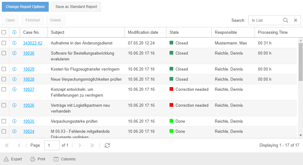
List
The data of all cases of a specific workflow can be displayed in a table with information in different columns. The following options are available during configuration:

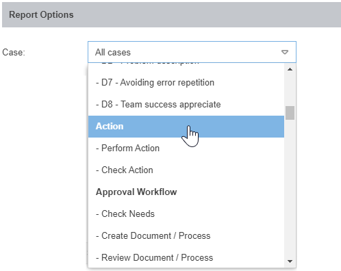
Case | Select the workflow whose cases are to be evaluated (in bold, for example, Action), or alternatively a task of the workflow that is to be evaluated (for example, Perform action). |
Columns | Use the dropdown menu to specify which general information and form fields should be displayed when the report is executed for the selected workflow. There is then a separate column for each piece of information in the results list of the executed report. After the evaluation has been executed using the Display report button, the order of the columns can be adjusted if required using drag & drop or the Columns button below the results list. |
State | Using the drop-down list, you can specify that only cases that are in one of the selected states are included in the results list. When you delete cases, they are set to the state "Deleted". By filtering according to this state, the deleted cases can be viewed again. |
Keyword | Enter a search term. If the term appears in any form field of the case, the case will be displayed in the result list. Sample term "Risk" - All cases where the word risk appears in either the Title of Action, Description of Planned Action, or any other text field will be displayed. |
Additional Filters | By clicking on the link <Additional Filters>, further options are displayed, which can be used to filter the cases of the selected workflow. Regardless of the selected workflow, all cases can be filtered according to fixed criteria. Fixed filters:
This filter is suitable for using a saved report to display the cases created in a workflow on a monthly base, without having to reconfigure the report every month.
Workflow dependent filters: Depending on the selected workflow, the fields from the main form serve as additional filter fields. For the workflow Action, these include "Activator" and "Short description action". If a task was selected for evaluation, the fields from the task form are offered for further filtering |
With a click on <Display Report> the result list is displayed. The possible options when working with the result list are described in the section Working with the result list in the article Reporting for processes and documents.
Diagram
You can also evaluate case data in SmartProcess using different types of diagrams. These include:
- Stacked bar chart (in horizontal and vertical orientation)
- Grouped bar chart (in horizontal and vertical orientation)
- Pie chart
- Pareto chart
Example 1 - Number of actions by activator and responsibility
In the following, the configuration of a diagram is shown using the example that all open and completed actions should be displayed in a bar chart, grouped according to their activator.
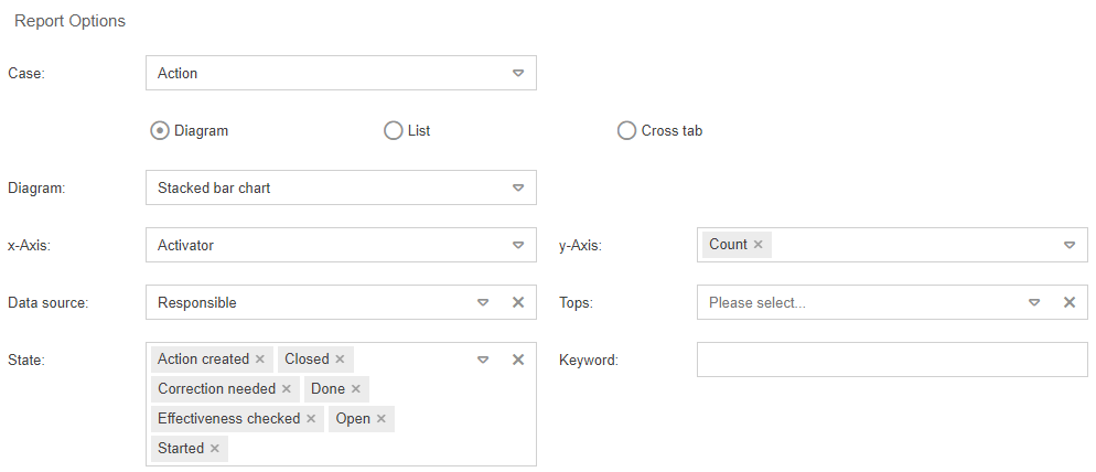
Diagram (mandatory) | Selection of the diagram type |
x-Axis (mandatory) | Select the criteria by which the data should be grouped along the x-axis. You can choose from fixed time specifications, for example, to group the number of actions per month or week. There will be a separate bar for each month/week in the resulting diagram. However, fields from the form of the selected case can also be used for grouping. In this case the field "Activator" is selected, which can be entered when creating an action case. With this configuration, a single bar is displayed in the diagram for each activator. |
y-Axis (mandatory) | The measured value is displayed on the y-axis. In this case, the number of actions is simply displayed, grouped by activator. In cases or tasks in which numerical fields are entered, the y-axis can also display a sum of this numerical values. |
Data source (optional) | With the optional selection of a Data source, a further differentiation of the data can be made in addition to the grouping by the x-axis. In this example, without a chosen Data source, the number of cases per activator would be displayed (including a bar for the "Complaint" activator). By selecting the "Responsible" criteria, you can further differentiate how many actions with the activator "Complaint" are assigned to certain users. |
Tops (optional) | The entries in a bar chart are usually sorted by the labels of the x-axis. You can use the "Top 10" selection to remove this default sorting so that the most frequent values are displayed instead, sorted from left to right or top to bottom (for example, to list the most frequent reasons for delays). If a Data source has been selected, the tops are sorted according to the values of the Data source (in the example, the bar on the far left would show the activator for which one person is responsible for most of the cases). If no Data source was selected, the tops are sorted according to the values of the x-axis (in the example, the bar with the most frequent activator would be on the far left). |
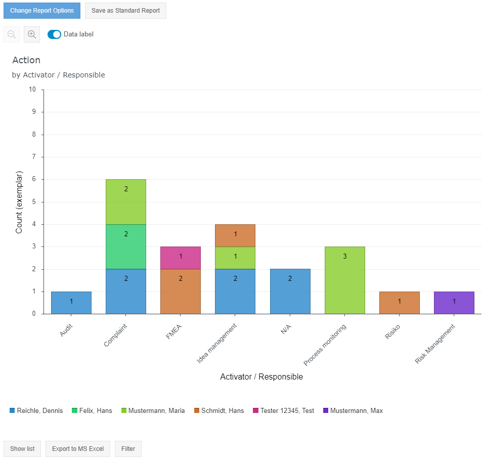
Options in the diagram view
Various options can then be carried out with the output diagram:
- The graphical report can either be saved as a saved report, displayed as a list evaluation instead, or exported as a Microsoft Excel file.
- Using the buttons above the graph, the data label in the diagram can be shown or hidden as required and the chart can be zoomed in or out.
- When a legend is displayed, the chart can be further filtered by clicking on individual legend entries.
- With <Change Report Options> you can subsequently adjust the configuration of the diagram.
The graphical report can either be saved as a saved report, displayed as a list evaluation instead, or exported as a Microsoft Excel file.
In addition, the data label in the chart can be hidden or shown as needed and the diagram can be zoomed in and out using the buttons above the chart.
With <Change Report Options> you can subsequently adjust the configuration of the diagram.
Display as pie / pareto chart
The same evaluation without specification of the Data source can also be displayed as a Pie chart or Pareto chart with the following results:
Pie chart | 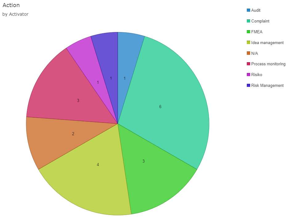 |
Pareto chart | 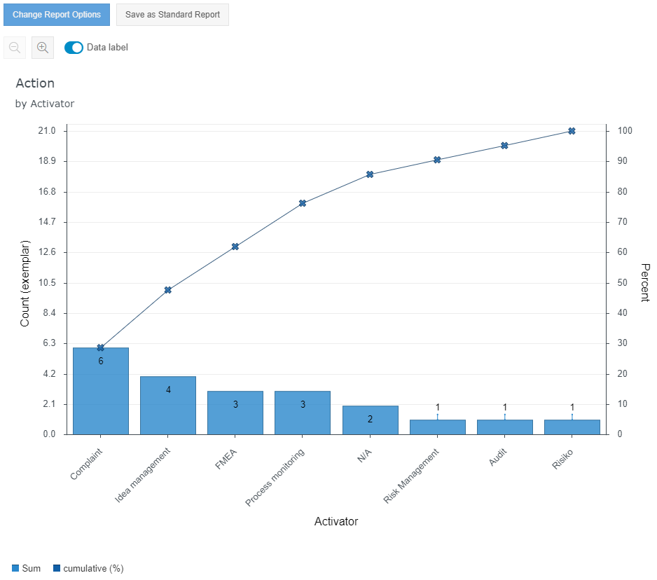 |
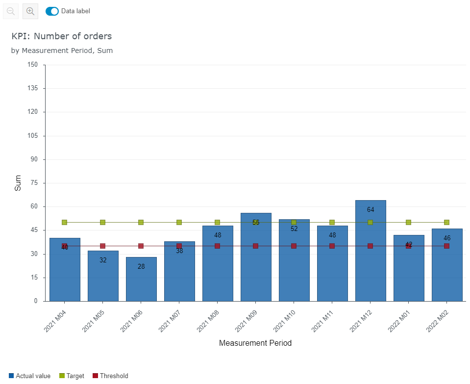
Example 2 - Captured values of a KPI case
The diagram can also be used to display the last recorded values of a KPI.
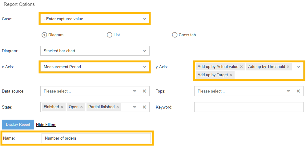
For this purpose, the last values entered in a KPI case should be displayed, which is why the task Enter captured value is selected in the case area.
When entering a KPI, the measurement period is always determined from the interval and the measurement date entered (e.g. "2022 M03" for a monthly interval and entry for 2022/03/12). To list the 10 most recently recorded values, select "Measurement Period" for the x-axis.
Several values can now be selected on the y-axis. The recorded actual value should be displayed as a bar. In order to place it in an interpretable context, the target and threshold values for the KPI valid at the time of recording are also displayed as lines.
Using the previous selection, all KPI entries would be included in the diagram. This means that if the values of two different KPIs were entered on day 05.06.2022, the values of the two KPIs would be displayed summarized as bars for this day. To prevent this from happening, the name of the KPI to be evaluated should be entered in the Name field via the additional filters.
Cross tab
Crosstabs can be used to display characteristics from a main case (for example, Audit) combined with characteristics from a subordinate activity (for example, Audit question).
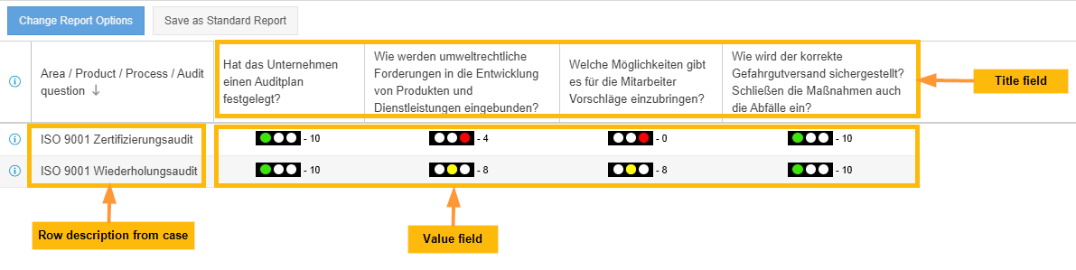
Example 1 - Comparing audit questions from repeated audits
A possible configuration might look like this:
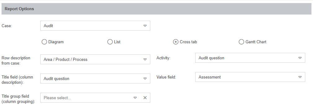
Case | Selection of the workflow whose cases are to be displayed per line. If the filtering results in 2 audit cases, the cross tab has 2 lines. |
Row description from case | A field from the main case (Audit) at the beginning of a line to identify the case. |
Activity | Tasks or sub-processes that are subordinate to the selected main case (in this case "Audit") can be selected as activities. If one of these activities was created several times for a case (= 1 line), several columns are generated in the cross table for this purpose. For example, if 4 audit questions were created and edited for 1 audit, 4 columns are generated in the crosstab. |
Title field (column description) | Analogous to the " Row description from case", this selection serves to identify the activity by means of a column label. In this case, the formulated audit question from the activity Audit question is displayed as a column label. |
Value field | This selection represents the information to be displayed in the cells of the crosstab. In this case, one row is generated for each audit with one column for each audit question processed. It is therefore useful to display the assessment of each audit question as combined information in the cell, which is why the value of the "Assessment" field is displayed from the "Audit question" activity. |
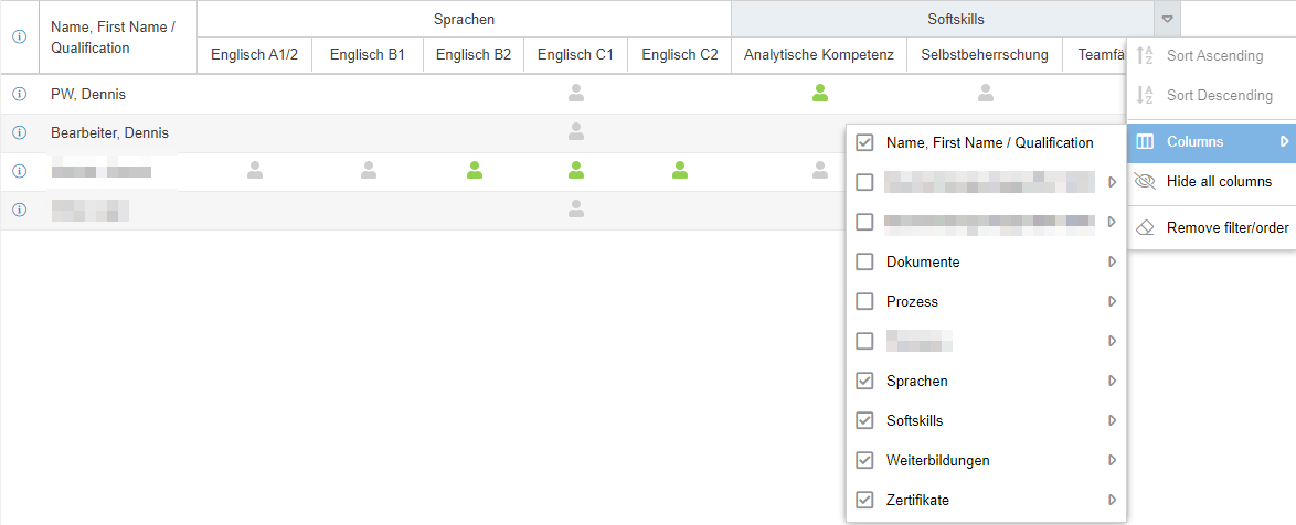
Title group field (Column grouping) (From Version 9.1.0.10) | This is an optional selection to group the column entries from "Title field (column description) by category. This works if a tree structure is configured and used for the catalogue of the column entry. For example, audit questions in the catalogue are grouped into audit question categories and qualifications by qualification categories. Without grouping, all audit questions in the cross tab are displayed alphanumerically in the columns (see screenshot). However, if the column activities are grouped by category, the audit questions are listed according to their category (see screenshot for example 2 - Qualification Matrix) |
Example 2 - Qualification matrix
The Qualification Management module, which can be purchased separately, provides you with a saved report with which you can display the required and acquired qualifications for each user. This qualifications matrix is also based on a crosstab report.
By grouping according to the qualification category, more structure can be brought into the listing of qualifications.
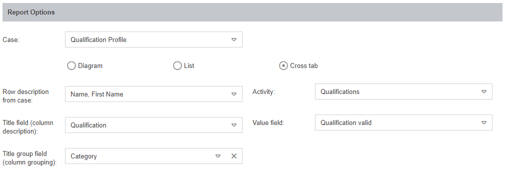
The grouped columns can also be used for advanced filtering.
How did we do?
Reporting for processes and documents
Saved reports